Good Energy
Foundation, academy and brand institute
Scroll to explore
Good Energy is a group of three organizations, a foundation, an academy, and a brand institute, that needed to look like one brand. We created a single brand identity and a full set of guidelines that work across all three.
Services
Branding
UI & UX Design
Webflow Development
Industry
Branding & Non-profit
Date
In progress
The challenge
Good Energy isn’t one organization, it’s three: a foundation, an academy, and a brand institute. Each has its own job, its own audience, and its own reason to exist. But they share a name, a mission, and a parent, so they need to look like they belong together.
That is harder than it sounds. Give each one its own logo and the family falls apart, nobody can tell they are connected. Force them all to use the exact same mark and the individual organizations lose their identity. What Good Energy wanted was a single logo that could work for all three at once.
On top of that, a brand only holds together if people use it consistently. Without clear rules, three organizations drift in three directions, and within a year the “one brand” becomes three lookalikes.

The Solution
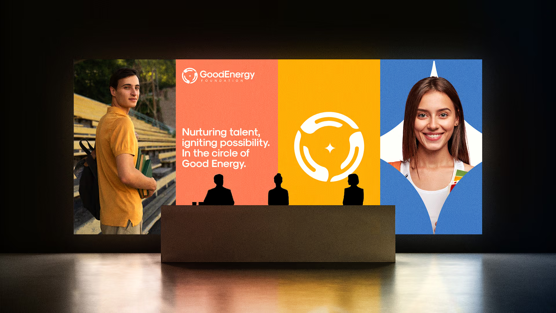
We designed one brand system with a flexible logo at its core. The mark holds the group together, and a clear brand architecture gives each sub-brand, Foundation, Academy, and Brand Institute, its own version that still reads as part of the whole.
Around the logo we built the rest of the system: a defined color palette, a typographic hierarchy, and a photography direction, so every touchpoint feels like Good Energy. Color, type, and imagery do a lot of the work of making three organizations feel related.
Then we wrote it all down. The full brand guidelines cover how the logo flexes, when to use which version, the colors, the type, and the photography, so anyone applying the brand, in-house or outside, gets it right without guessing.
The result
Good Energy isn’t one organization, it’s three: a foundation, an academy, and a brand institute. Each has its own job, its own audience, and its own reason to exist. But they share a name, a mission, and a parent, so they need to look like they belong together.
That is harder than it sounds. Give each one its own logo and the family falls apart, nobody can tell they are connected. Force them all to use the exact same mark and the individual organizations lose their identity. What Good Energy wanted was a single logo that could work for all three at once.
On top of that, a brand only holds together if people use it consistently. Without clear rules, three organizations drift in three directions, and within a year the “one brand” becomes three lookalikes.
.avif)
The takeaway
When one name has to cover several organizations, the win is a flexible logo plus a clear brand architecture, written down as guidelines. One system, three sub-brands, one consistent look that holds up as it grows.