Čardak
A RESIDENTIAL BRAND BUILT FROM THE PROPERTY OUTWARD
BRAND STRATEGY · BRAND IDENTITY · UX/UI · WEBFLOW DEVELOPMENT
Čardak Residence is a luxury residential development in Novi Sad. We created the identity, digital experience and physical brand applications as one system built around privacy, warmth and a more considered sense of home.
001 / THE SETUP
A NEW DEVELOPMENT NEEDED MORE THAN A PROPERTY LOGO
Čardak was starting without an established brand, so the identity had to do several jobs at once: introduce the development, communicate a premium position and work naturally across the property itself.
The goal was to avoid the generic visual language common in residential marketing and build something that felt specific to the architecture, location and quieter experience the project wanted to offer.
002 / THE IDEA
TURN THE NAME INTO A RECOGNISABLE MARK
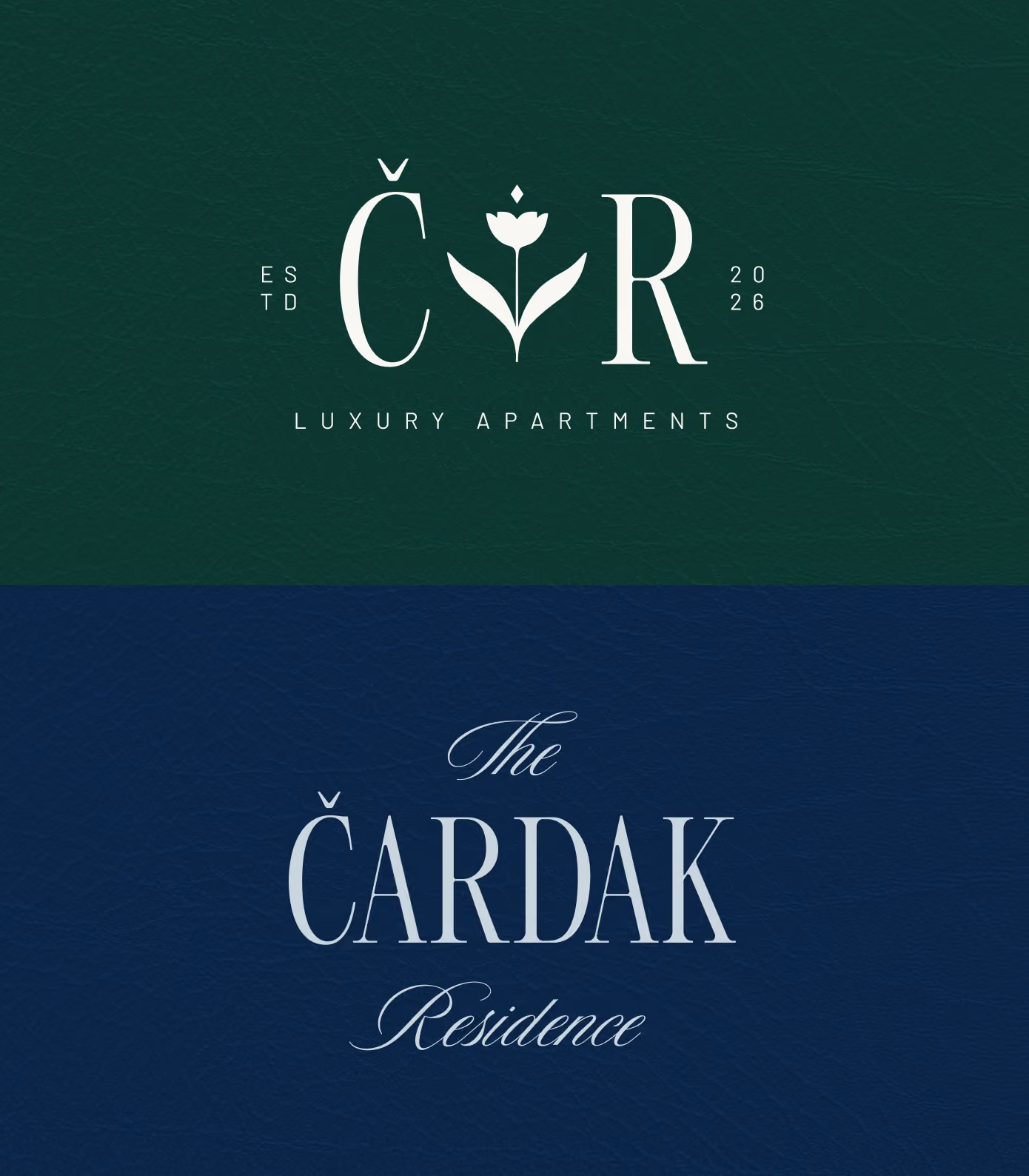
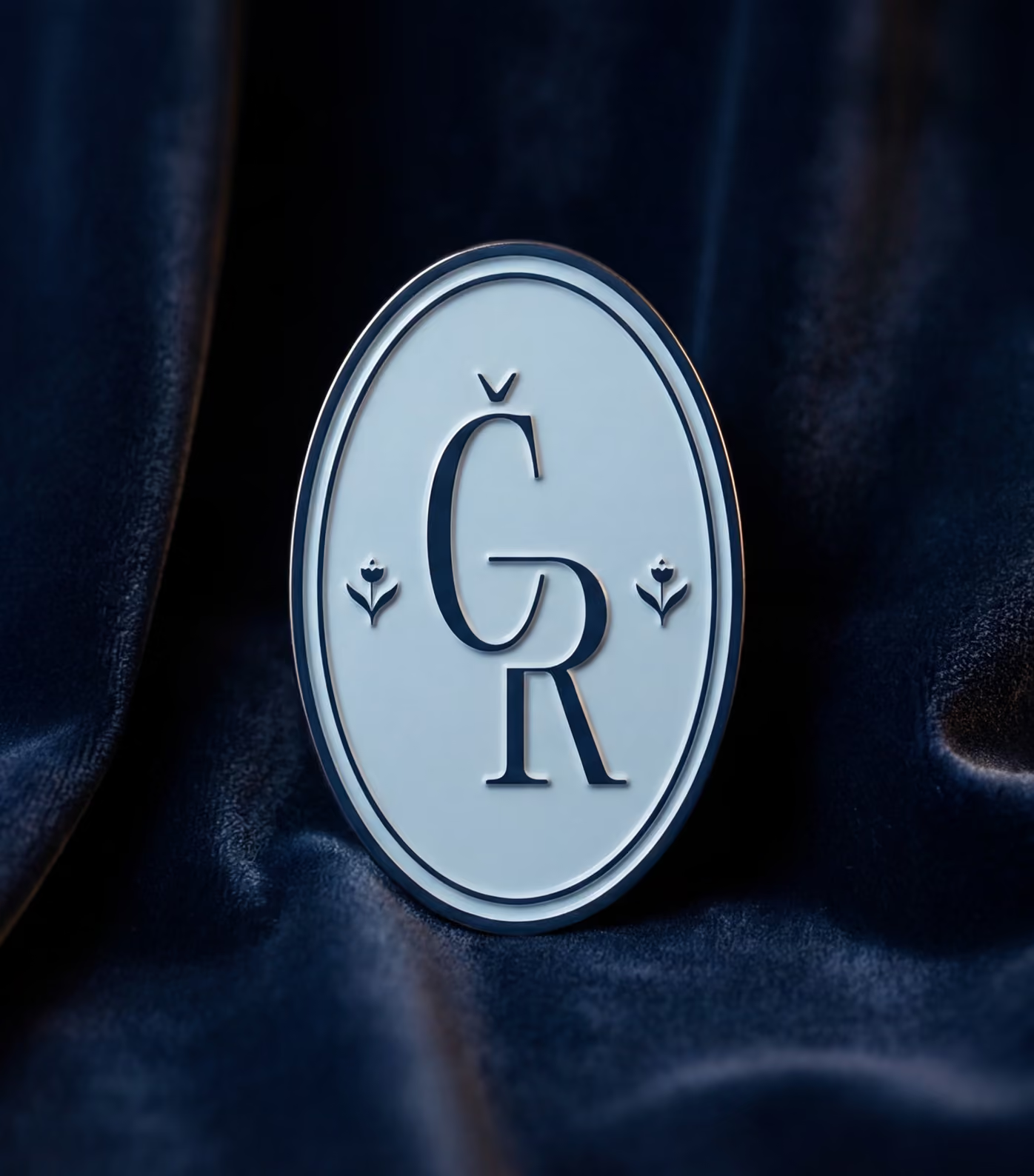
The CR monogram and wordmark became the centre of the identity. Their proportions were designed to feel architectural and composed, giving the project a signature that works at both large and small scales.
A deep green, navy and gold palette adds warmth and distinction without relying on obvious luxury clichés, creating a system that feels premium while remaining restrained.
003 / THE SYSTEM
BUILD ONE SYSTEM ACROSS DIGITAL AND PHYSICAL SPACE
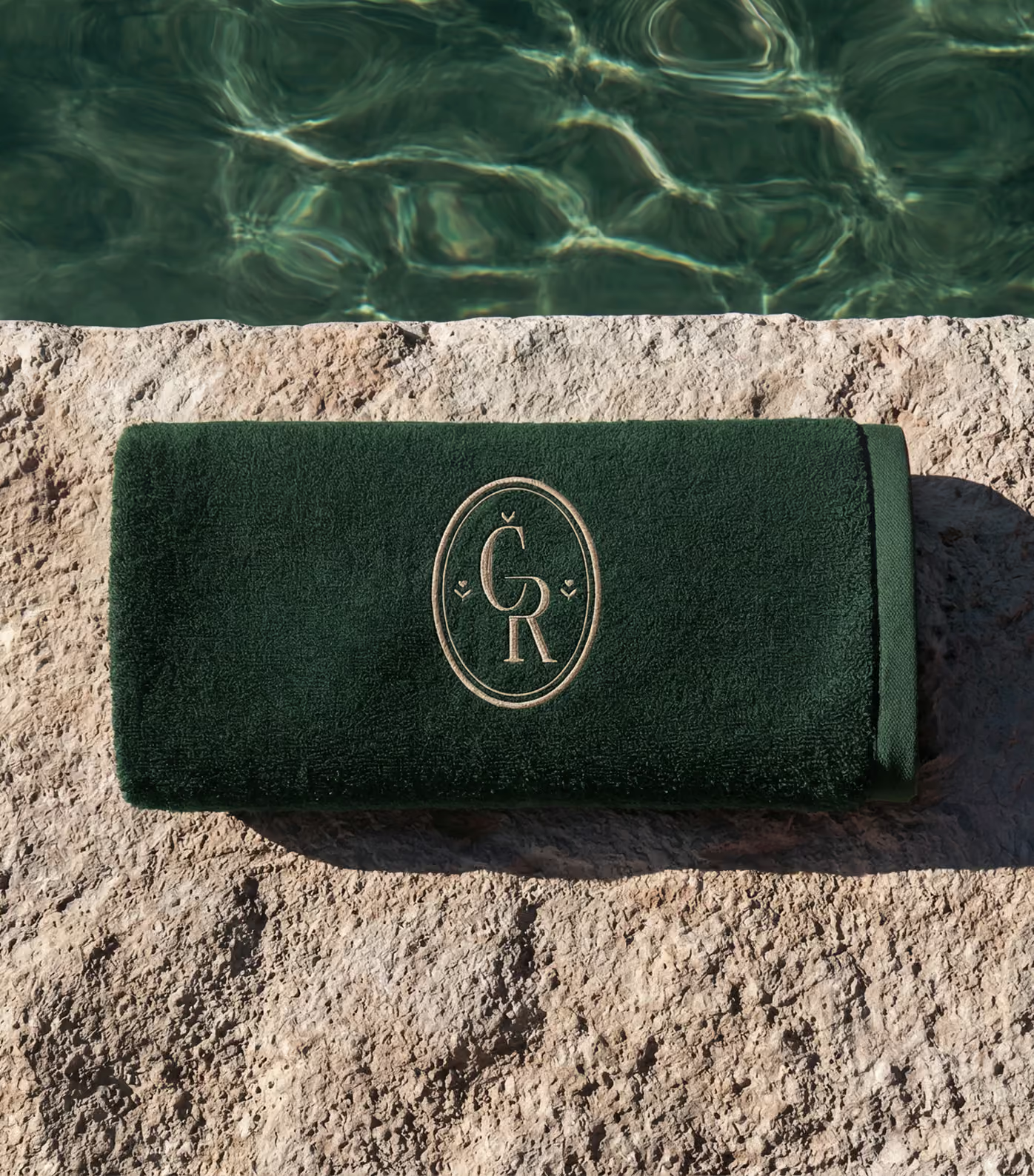
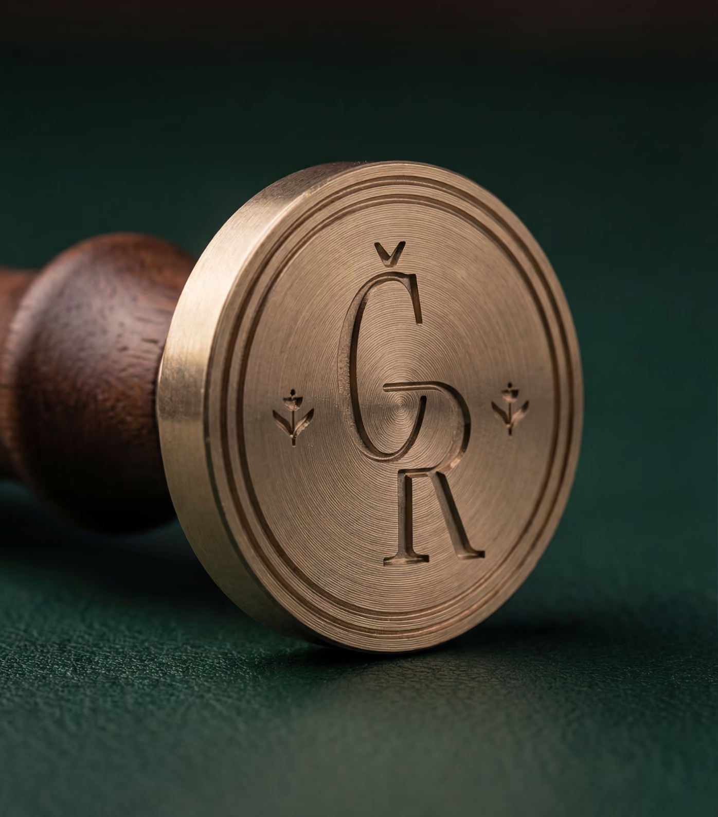
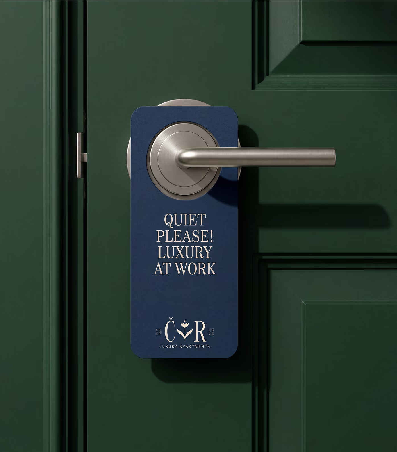
The identity had to work beyond the sales presentation. Signage, room and door pieces, printed material, framed artwork and smaller branded objects all needed to feel like parts of the same environment.
We built the system around repeatable typography, colour and mark behaviour so each application can change in scale and material without losing the character of the residence.
004 / DIGITAL DIRECTION
CREATE A DIGITAL EXPERIENCE THAT SELLS THE FEELING
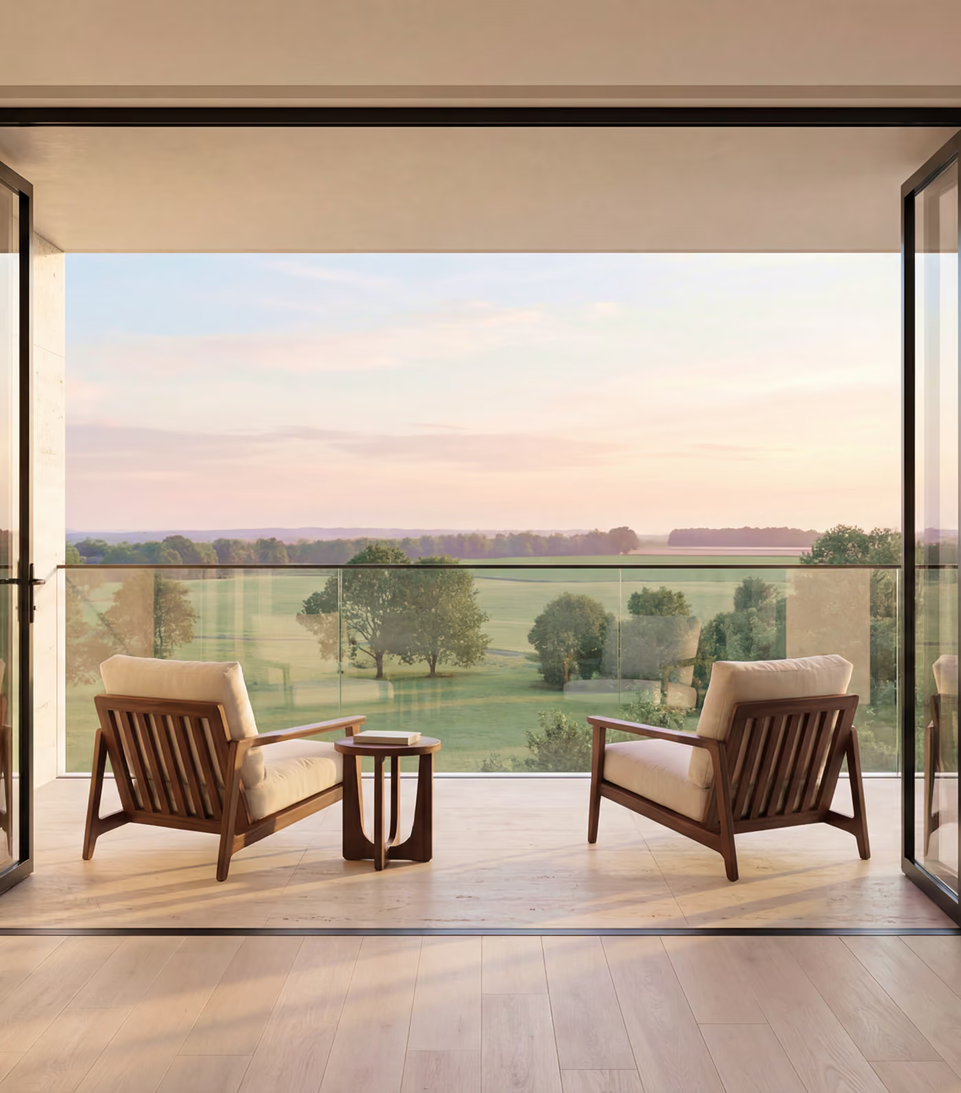
The website was designed around the atmosphere of the property rather than a hard sales journey. Space, material, architecture and lifestyle carry the story before the user moves into practical information.
The interface stays deliberately quiet, using clear hierarchy and controlled motion to support the imagery while making plans, apartment information and project details easy to reach.
005 / APPLICATIONS
TAKE THE BRAND INTO THE DETAILS PEOPLE TOUCH
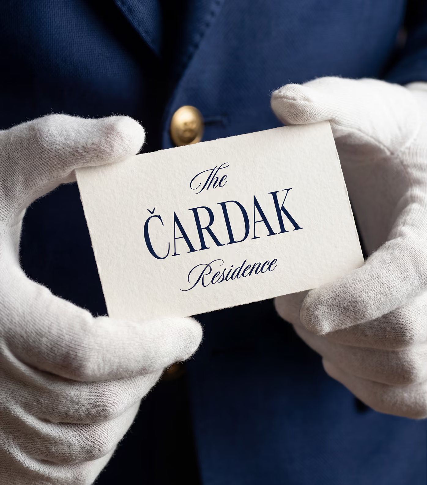
The same visual language extends into welcome material, stationery, signage and branded objects, turning the identity into something residents and visitors encounter beyond a screen.
Those smaller applications matter because they make the project feel considered as a whole. The brand is not added afterward, it is part of how the residence presents itself.
006 / THE OUTCOME
A COMPLETE IDENTITY FOR A NEW RESIDENTIAL ADDRESS
Čardak now has a coherent brand that can move from marketing to the built environment without changing personality. The digital and physical touchpoints reinforce the same premium, understated position.
The result is a stronger foundation for presenting the development, supporting sales and carrying the identity forward as the property moves from launch into everyday use.
KEEP SCROLLING FOR THE NEXT PROJECT