Fructal
A HERITAGE BRAND REFRAMED FOR A MODERN DIGITAL AUDIENCE
DIGITAL STRATEGY · UX/UI · WEB DESIGN · DEVELOPMENT
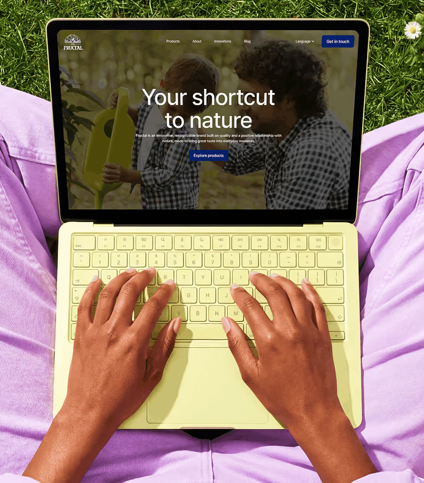
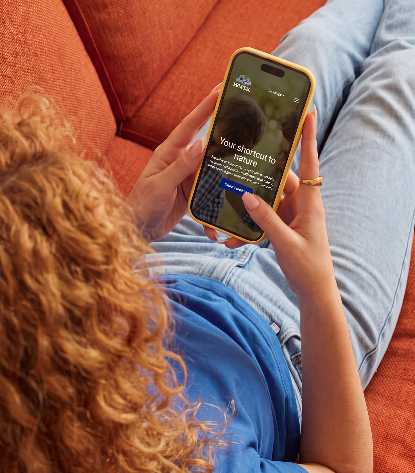
Fructal has built generations of recognition around fruit, quality and a close relationship with nature. We created a new digital experience that gives the company, its products and its wider brand portfolio room to breathe.
001 / THE SETUP
DECADES OF BRAND EQUITY NEEDED A CLEARER DIGITAL STRUCTURE
Fructal carries a long history, multiple brands and a broad product portfolio. Bringing all of that into one website meant balancing corporate credibility with the colour, personality and familiarity people already associate with the products.
The problem was not a lack of content. It was giving history, products, responsibility, innovation and individual brands a clear place without turning the site into a dense corporate archive.
002 / THE IDEA
MAKE THE PORTFOLIO FEEL LIKE A FAMILY, NOT A LIST
Each brand needed enough space to preserve its own character while still feeling connected to Fructal. We treated the portfolio as a collection of distinct identities held together by one broader company story.
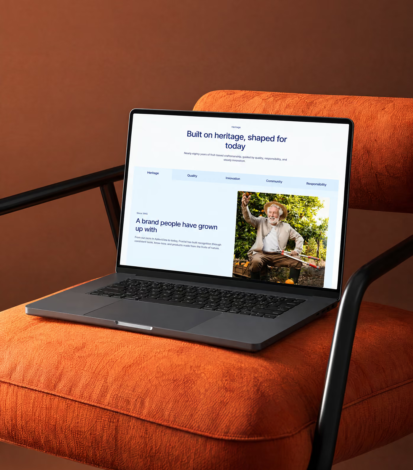
That approach lets visitors move from Fructal's heritage into individual products and brands without losing context, while giving each part of the portfolio a stronger moment of its own.
003 / THE SYSTEM
BUILD THE EXPERIENCE AROUND CONTENT THAT ALREADY MATTERS
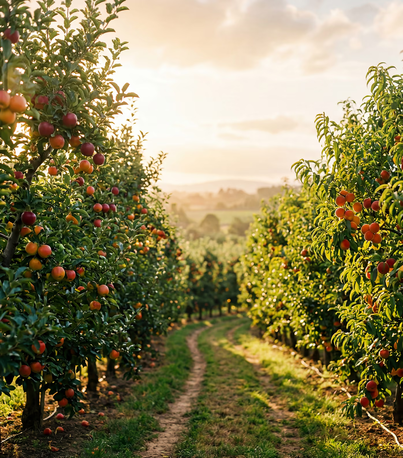
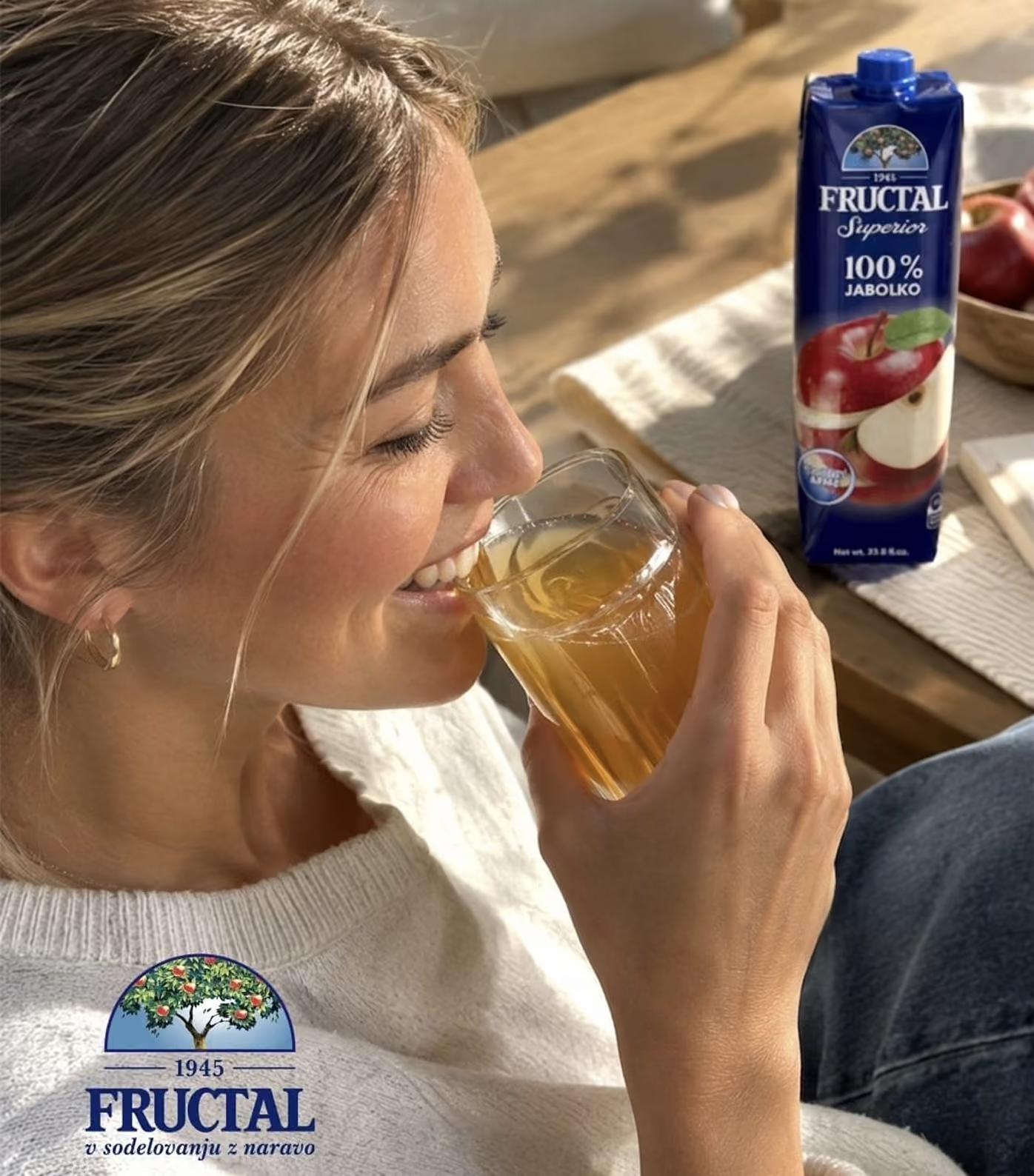
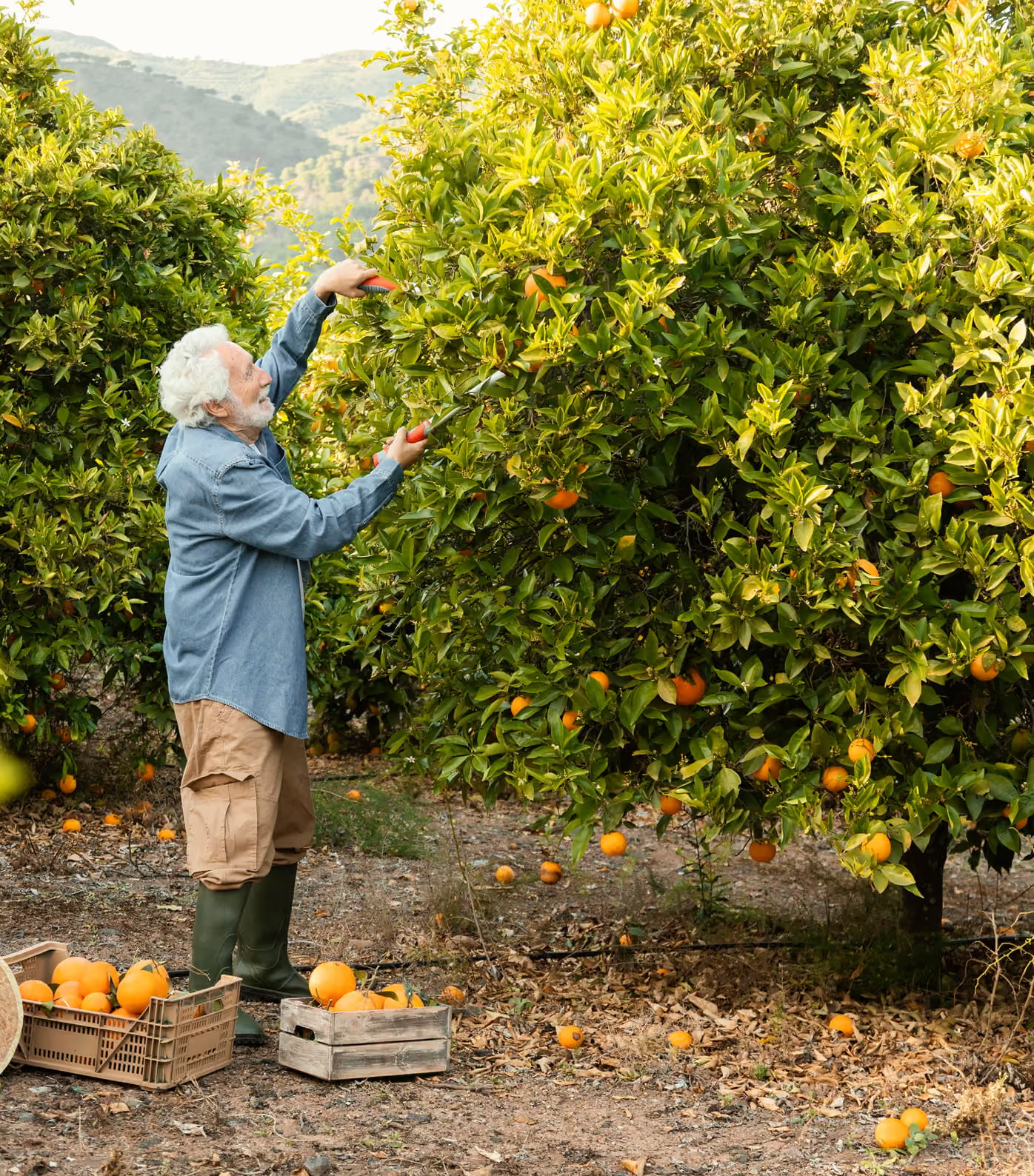
Existing photography, campaign material, product assets and factory footage became part of the digital system rather than decoration added at the end.
The structure was designed to let those assets carry more of the story, combining strong art direction with clear content hierarchy so the site can move between playful brand moments and serious company information.
004 / DIGITAL DIRECTION
GIVE PRODUCT AND COMPANY STORIES DIFFERENT RHYTHMS
Product discovery needs immediacy, while heritage, quality and responsibility need more room to explain themselves. The digital direction uses different page rhythms without making the overall experience feel fragmented.
Bold visual sections bring energy to the portfolio, while quieter editorial moments create space for manufacturing, standards, history and the wider story behind the company.
005 / APPLICATIONS
MAKE ROOM FOR CONSUMERS AND BUSINESS PARTNERS
The website has to speak to people discovering products as well as distributors, wholesale partners and private-label opportunities. Those journeys were organised separately so neither audience has to decode content meant for the other.
A clearer B2B layer gives commercial information proper weight without pulling the main consumer experience away from the products and brands people already know.
006 / THE OUTCOME
A DIGITAL EXPERIENCE THAT FEELS LIKE FRUCTAL TODAY
The result is a clearer, more expressive way to present Fructal's history, portfolio and relationship with nature without flattening the company into one visual tone.
The new structure gives every part of the business more room to communicate, while the overall experience stays recognisable, confident and ready to evolve with the portfolio.
KEEP SCROLLING FOR THE NEXT PROJECT