ROYA Digital
DISTINCTIVE IDENTITY BUILT AROUND AN EYE
BRAND STRATEGY · BRAND IDENTITY · WEB DESIGN · WEBFLOW DEVELOPMENT
ROYA is a Dubai-based digital agency working across branding, websites, video and marketing. We created a visual identity centred on the ROYA Eye, then built a system designed to stay recognisable across every touchpoint.
001 / THE SETUP
A WIDE OFFERING NEEDED A CLEARER POINT OF VIEW
ROYA works across branding, websites, video and marketing. That breadth is a strength, but it also creates a branding problem: when you can do many things, it becomes harder to be remembered for one.
The task was to give ROYA a recognisable centre. Something distinctive enough to hold the brand together, while staying flexible across very different kinds of work, formats and clients.
002 / THE IDEA
ONE SYMBOL TO HOLD IT ALL TOGETHER
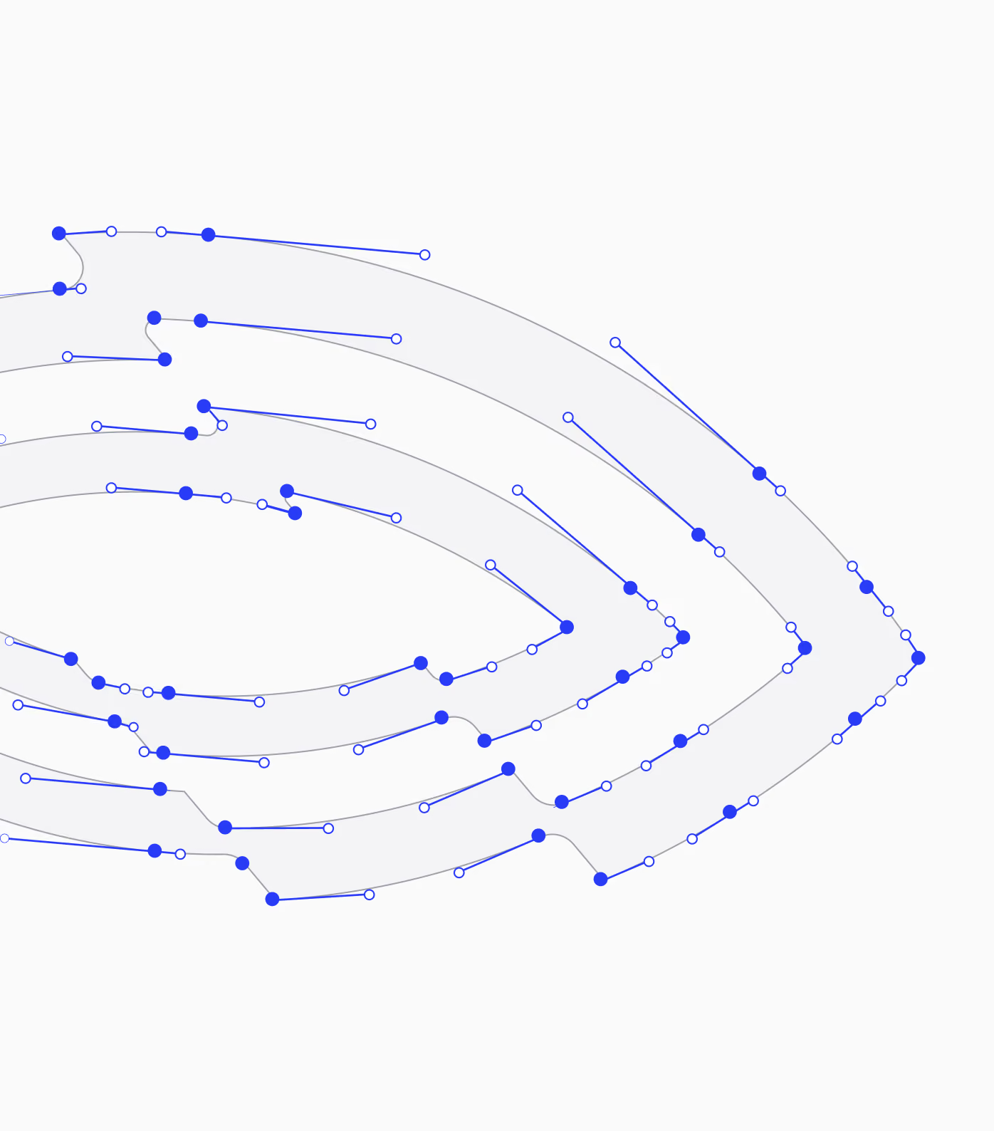
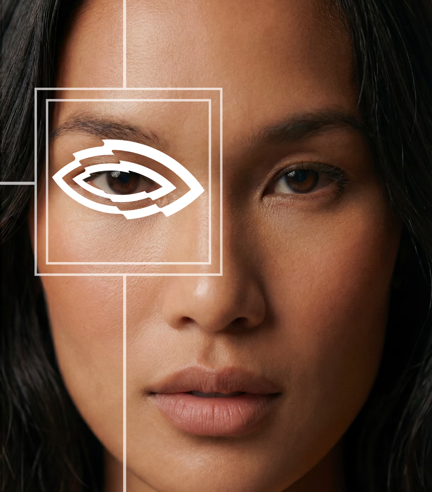
The ROYA Eye became the organising idea for the identity. Simple enough to recognise instantly, but flexible enough to behave differently across branding, digital, motion and campaign work.
Rather than treating it as a logo that sits in the corner, we built it as a visual device. It can frame, crop, reveal, repeat and direct attention, giving ROYA a recognisable signature without forcing every piece of communication into the same layout.
003 / THE SYSTEM
BUILT TO STRETCH WITHOUT LOSING ITS SHAPE
The challenge wasn’t creating one memorable mark. It was making sure the identity could keep its character across very different outputs, from campaigns and social content to websites, motion and client work.
We built the system around a small set of recognisable behaviours: the Eye, bold framing, strong contrast, and a visual language that could expand or simplify without losing ROYA’s point of view.
004 / DIGITAL DIRECTION
A FIRST GLIMPSE OF WHAT’S IN THE CARDS FOR THE FUTURE
With the full website still in development, the coming-soon page became the first place the new identity had to live digitally. It needed to feel complete enough to introduce ROYA properly, without pretending to be the finished experience.
We used it to establish the tone early: bold typography, controlled motion and the Eye as an active part of the interface rather than a static brand mark. A compact first release, but already recognisably ROYA.
005 / APPLICATIONS
A SYSTEM DESIGNED TO SHOW UP EVERYWHERE
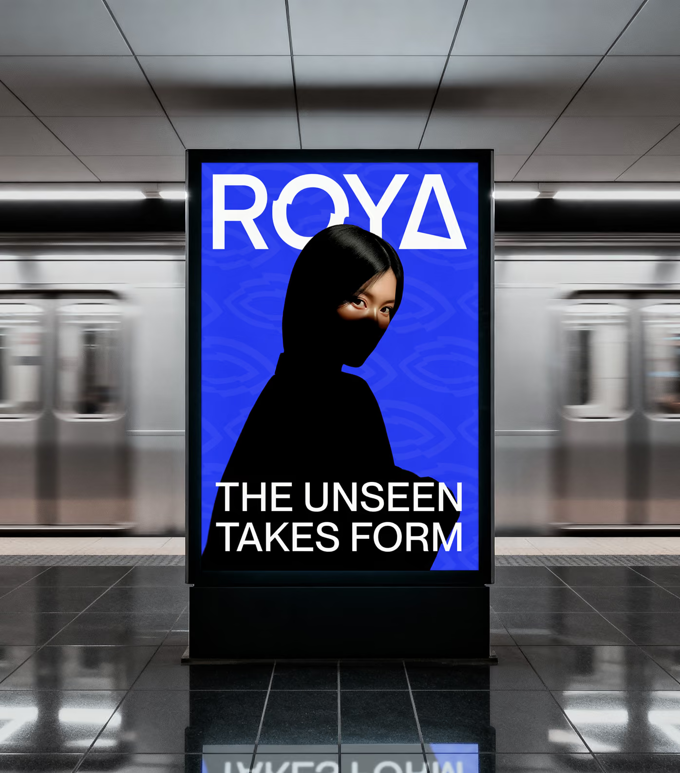
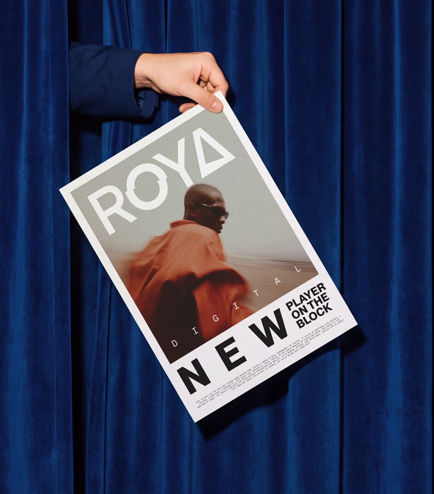
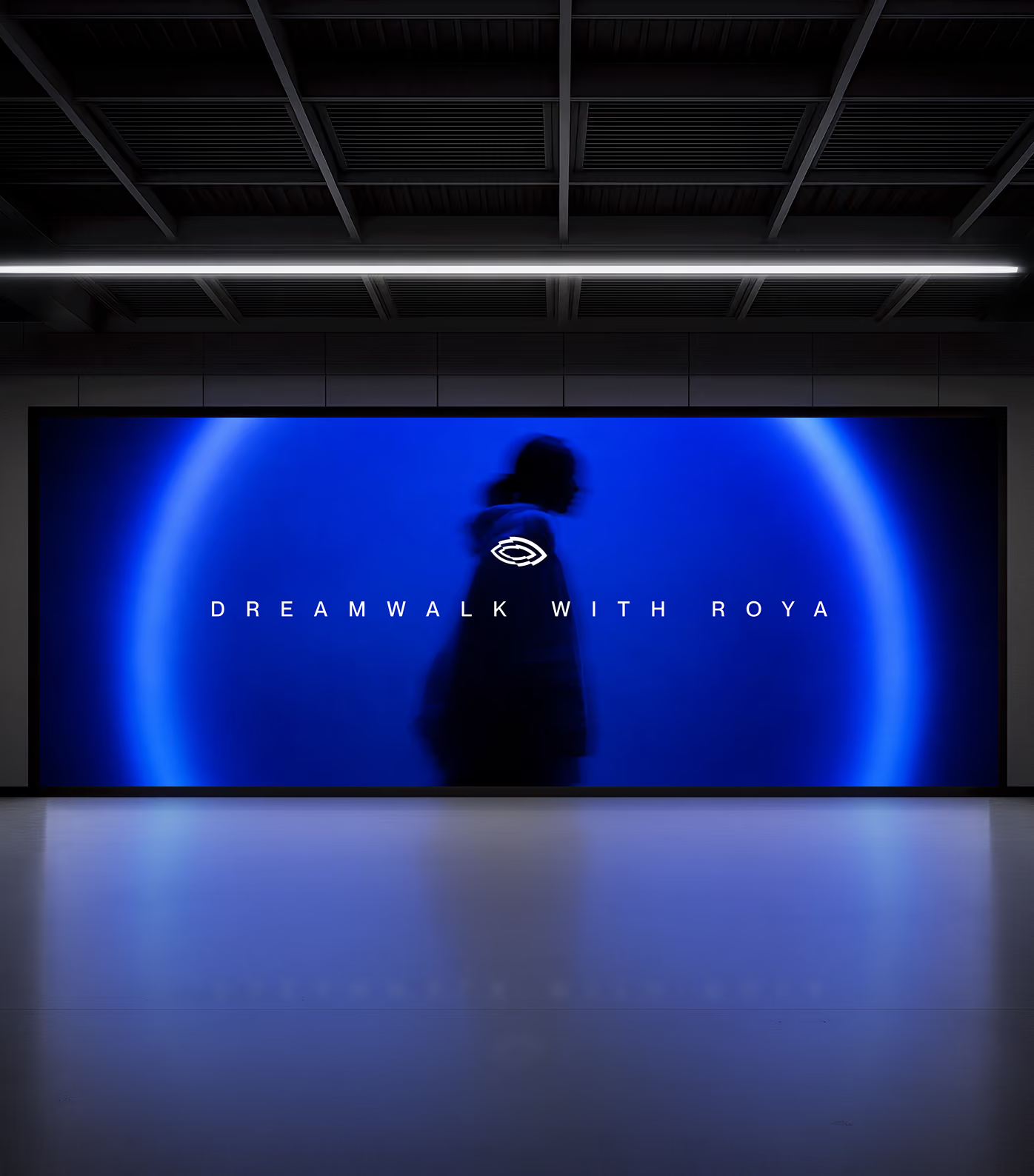
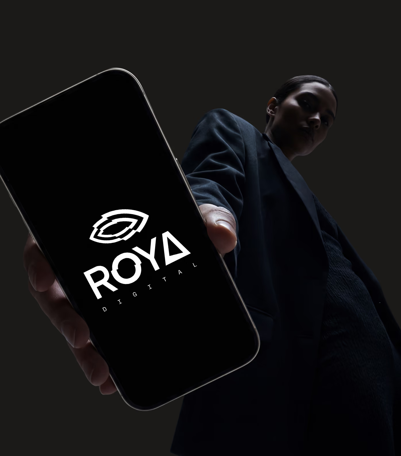
Once the core identity was defined, the focus shifted to making sure it could hold together across very different formats. Campaigns, social content, presentation material and branded touchpoints all needed to feel recognisably ROYA without repeating the same composition.
The system gives each application room to change while keeping a consistent visual signature through the Eye, typography, framing and contrast.
006 / THE OUTCOME
ONE CLEAR IDEA, WITH ROOM TO KEEP GROWING
ROYA now has a visual identity that can move across very different kinds of work without losing its centre. The Eye gives the brand an immediate signature, while the wider system leaves enough freedom for campaigns, digital experiences and future applications to evolve around it.
Instead of defining ROYA by a single service or aesthetic, the identity gives everything they do a common point of view: recognisable when it needs to be, flexible when the work demands it.

KEEP SCROLLING FOR THE NEXT PROJECT