ROYA Digital
Digital agency based in Dubai
Scroll to explore
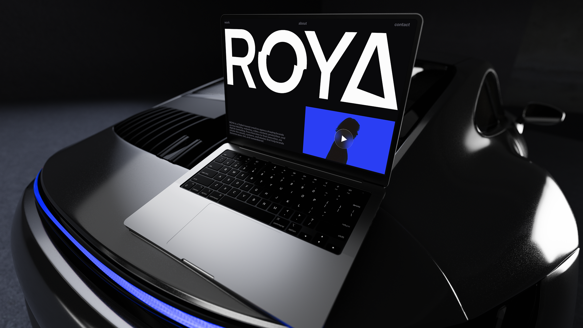
ROYA is a Dubai-based digital agency built around branding, websites, video, and marketing. We created a full identity direction around the ROYA Eye, a modern luxury visual language, and a digital-first brand system that can stretch from the website to campaigns, social, presentations, and client-facing material.
Services
Brand Identity
UI & UX Design
Webflow Development
Industry
Marketing
Date
In progress
The challenge
Dubai is a market that rewards polish. The problem is that a lot of brands reach for the same version of it: gold details, marble textures, generic luxury language, big promises, and layouts that look expensive for a second but feel familiar almost immediately.
ROYA needed something sharper than that. The name already carried a strong idea, vision and dream, but meaning alone does not build a brand. It needed a visual identity that could make that idea visible, something modern enough for a digital agency and premium enough for the Dubai market, without falling into the usual luxury clichés.
The real challenge was distinction. ROYA could not afford to look like another “full-service digital agency” with a polished logo and a nice website. It needed a point of view. A symbol, a mood, a rhythm, and a system strong enough to be recognized before the first line of copy is even read.

The Solution
We built the identity around one central visual idea: the ROYA Eye.
Instead of treating the logo as a decorative mark, we used the eye as the foundation of the whole brand. It gives the identity a clear meaning, vision, focus, perception, and attention. Those ideas connect naturally to what ROYA does: helping brands see better, look better, and show up with more clarity across digital channels.
The visual direction became a modern interpretation of old-school luxury. Not traditional, not corporate, and not overly polished in the expected way. Darker compositions, deep blue tones, blurred motion, sharp typography, editorial imagery, and high-contrast layouts give the brand a cinematic quality while keeping it clean and digital.
From there, we shaped the system so it could work across every touchpoint. The website, social posts, mockups, presentation material, campaign visuals, and brand messaging all pull from the same world. ROYA does not just have a logo; it has a recognizable atmosphere.
The result
Dubai is a market that rewards polish. The problem is that a lot of brands reach for the same version of it: gold details, marble textures, generic luxury language, big promises, and layouts that look expensive for a second but feel familiar almost immediately.
ROYA needed something sharper than that. The name already carried a strong idea, vision and dream, but meaning alone does not build a brand. It needed a visual identity that could make that idea visible, something modern enough for a digital agency and premium enough for the Dubai market, without falling into the usual luxury clichés.
The real challenge was distinction. ROYA could not afford to look like another “full-service digital agency” with a polished logo and a nice website. It needed a point of view. A symbol, a mood, a rhythm, and a system strong enough to be recognized before the first line of copy is even read.

The takeaway
In a premium market, the job is not to decorate a brand until it looks expensive. The job is to give it something it can own. For ROYA, that became the eye, a simple visual idea turned into a complete identity system.
